How to Use Business Data Visualization Techniques and Tools
Sat, 11 Dec 2021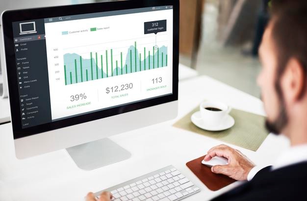
Data visualization is a crucial aspect of many
firms' business strategies due to the ever-increasing volume of data and its
value for the business.
In this post, we look at some of the most popular
data visualization tools and discuss the aspects that influence how people
choose visualization techniques and tools. We'll go over the most popular data
visualization tools and offer some pointers on how to integrate data
visualizations into useful dashboards.
This article includes the following sections:
·
Data visualization approaches are
determined by a number of factors.
·
The most common data visualization
approaches and how they're used.
·
Data visualization, exploration, and
analytics tools.
·
Tips for making data dashboards that are
both efficient and responsive.
·
Real-world applications and potential
collaborations
What factors influence data visualization decisions?
The first step in making sense of data is to
visualize it. Data analysts employ various data visualization approaches,
including charts, diagrams, and maps, to translate and present complicated data
and relationships in a straightforward manner. The right technique and its
implementation are frequently the only ways to make data intelligible. Poorly
chosen strategies, on the other hand, may not allow data to reach its full
potential, and may even render it obsolete.
The following are five elements that influence data visualization
decisions:
Audience. It's critical to tailor data visualization
to the target audience. Users of fitness mobile apps, for example, may easily
work with simple representations to track their progress. If data insights are
intended for researchers and experienced decision-makers who work with data on
a regular basis, however, you can and should go beyond simple charts.
The tactics will be determined by the type of data
you're dealing with. When it comes to time-series metrics, for example, line
charts are frequently used to depict the dynamics. Scatter plots are frequently
used to depict the relationship between two factors. Bar charts, on the other
hand, are ideal for comparative analysis.
Context.
Depending on the situation, you can utilize various data visualization
techniques and read data. You can use the shades of one hue on the chart to
emphasize a certain statistic, such as considerable profit growth, and
highlight the greatest value with the brightest one. Contrast colors, on the
other hand, can be used to distinguish items.
Dynamics.
There are many different sorts of data, each with its own rate of change.
Financial outcomes, for example, can be measured monthly or annually, whereas
time series and tracking data are always changing. In data mining, you can use
dynamic representation (steaming) or static data visualization approaches,
depending on the rate of change.
Purpose.
The purpose of data visualization has an impact on how it is implemented.
Visualizations are compiled into dynamic and controlled dashboards packed with
various tools for visual data analytics in order to make a sophisticated
analysis (comparison, formatting, filtering, etc.).
POPULAR POSTS

Minimum Budget for Facebook Ads in India in 2025 – What Works
Tue, 20 Jan 2026

Why UX And UI Is Important For Mobile Application Development
Sat, 01 May 2021
The Difference between Digital Marketing and Advertising
Wed, 07 Apr 2021
What are pseudocode and its advantages
Fri, 07 May 2021RECENT POSTS

How Page Speed Affects SEO & Conversion Rates | Real Insights 2026
Tue, 27 Jan 2026
Website API Development: How to Boost Scalability & Functionality
Tue, 27 Jan 2026
Minimum Budget for Facebook Ads in India in 2025 – What Works
Tue, 20 Jan 2026
How PHP and Laravel Help Build Secure Websites | PHP Security
Tue, 20 Jan 2026
Why Every Business Needs a Mobile App Today – Simple Guide
Tue, 20 Jan 2026